The COVID-19 Pandemic has disrupted businesses worldwide with numerous organizations opting for a Work-From-Home policy for their employees. Teradata,
one of the world's most ethical companies, also enforced WFH throughout its offices globally to ensure employee well-being. As employees continue to work from their homes, Teradata’s Pandemic Response Team (PRT) continuously monitors the situation and will decide when to reopen the offices worldwide. To support the decision-making, a team of data scientists at the company developed an analytical solution to quantify and predict the rate of disease spread in regions where Teradata offices are situated. In this post, we give an overview of the solution and describe the core components.
The Data Pipeline and the RTO Dashboard
We developed the analytical models using publicly available data published by
John Hopkins University. We also integrated Google’s
Mobility and Oxford University’s
Policy data in our solution. The data is stored and processed on
Teradata Vantage, and Tableau and Power BI dashboards connect to Vantage to visualize the results and depict the latest situation regarding COVID-19.
The COVID-19 Intensity Model
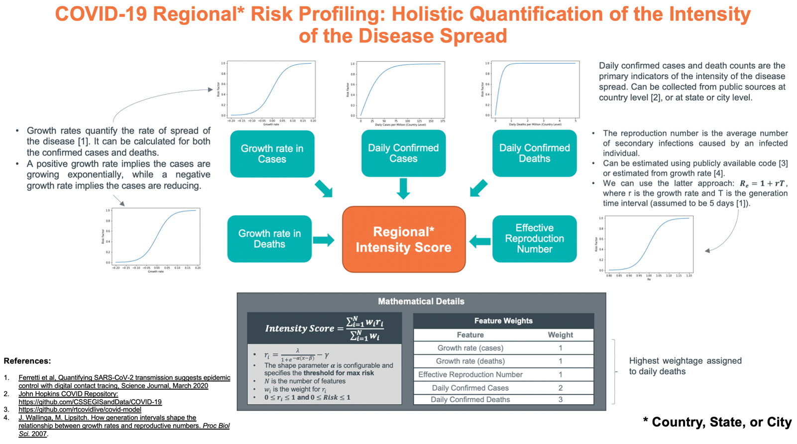
To quantify the intensity of COVID-19 at a regional level, we consider several metrics for a given geographical region (city, state, or country). These metrics include the daily cases per million, the daily deaths per million, the growth rates in the number of cases/deaths, and the effective reproduction number (Re). For each of these metrics, a normalized risk factor is computed and combined using a weighted sum model to devise a normalized
COVID-19 Intensity Score ranging between 0 and 1. The score holistically quantifies the regional intensity of COVID-19 in a given region where a higher value would indicate higher severity of the disease. A summary of the model is given in the graphic below. The weights of each risk factor and the maximum thresholds that define the shape of the sigmoid functions are fully configurable in the dashboard.

The intensity scores can be calculated for a region at different granularities that can be at the city level, the state level, or the country level, depending upon the availability of data. In the figure below, we show the calculated scores for every country on a geographic map. The colors depict the intensity of COVID-19 in that region.
.png) Figure 2 Visualization of COVID-19 Intensity Scores (for reference only)
Figure 2 Visualization of COVID-19 Intensity Scores (for reference only)
Predictive Modeling
Our work not only provides information on the present but also provides forecasts for the future. These forecasts help estimate when the pandemic will recede. The estimations are obtained using a well-known epidemiological model based on the
Logistic Growth function. It provides approximate timelines for when the pandemic will recede. A snapshot of the predictions shows the forecasts made for several countries.
.png) Figure 3 The Daily Case Forecasts using the Logistic Growth Model (for reference only)
Figure 3 The Daily Case Forecasts using the Logistic Growth Model (for reference only)
Google Mobility and Global Policy data
In the dashboard we have also incorporated data from Google and Oxford University to help understand how the general public and the government agencies react to the current COVID-19 situation. The
Mobility data, provided by Google, shows the relative mobility rates of a region compared to a baseline estimate; the baseline comes from the mobility rates observed in Feb 2020. The
Policy data from Oxford summarizes the policies enforced by the different countries concerning school closures, workplace closures, travel restrictions, etc. Combining the intensity model with the mobility and policy data provides a detailed picture of the pandemic and the population’s behavior to COVID-19. For example, the comparison of the intensity scores with the mobility rate indicates that the mobility rate is generally higher in regions where the intensity scores are low, as shown below:
.png) Figure 4 COVID-19 Intensity vs Mobility (for reference only)
Figure 4 COVID-19 Intensity vs Mobility (for reference only)
Using the Intensity Scores in RTO Decision Making
Each Teradata site is categorized into different risk levels using the intensity score. It helps determine whether to open a particular office or not. For example, a site is considered for episodic return if the intensity score falls below a value of 0.5; this decision threshold is configurable and can be changed depending upon the stringency level.
.png) Figure 5 Site Decision Analysis Dashboard (for reference only)
Figure 5 Site Decision Analysis Dashboard (for reference only)
Overall, the RTO dashboard is facilitating management in its decision-making and shows how advanced analytics, powered by Teradata Vantage, can help organizations plan a safe return to office.
Acknowledgements
The Pandemic Response Team (PRT) is led by Paul Williams (Senior Vice President and Chief Security Officer). The RTO analytics dashboard is developed by GDC, headed by Sandeep Kumar (VP, Global Delivery Centers). Sherwin Pelayo (GDC BI Sub-Practice Lead) managed the overall project, Dr. Muhammad Jawad Khokhar (Data Scientist, GDC Pakistan) led the development of the analytical models, Fitzroy Dy (Sr. Data Scientist, GDC Philippines) managed data sourcing and preprocessing, and Arun Chaudhary (Lead BI Consultant, GDC India) developed the Power BI dashboard.
(Author):
Muhammad Jawad Khokhar
Jawad is an experienced Data Scientist with a PhD in Computer Science from Inria Sophia Antipolis, France. He has extensive experience in the Telecom sector where he has undertaken several projects in network operations, modeling, analysis, and optimization. At Teradata, he has worked on Data Science projects for several industries including Telecom, Healthcare, and Oil & Gas. Overall, his expertise lies in data science, machine learning, and Internet measurements. Currently, he is part of Teradata’s COVID360 initiative where he has developed a framework for modeling, simulation, and risk profiling of COVID-19.
View all posts by Muhammad Jawad Khokhar